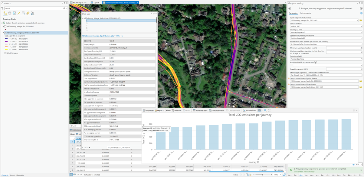
In this blog we look at how the GPS data recorded with video data, or by standalone/phone-based trackers, can be used to generate insights into vehicle motion and to support approximate emissions analysis and mapping. As the introduction of zero emission vehicles to fleets will generally be a gradual process these insights may be of use to fleet operators looking to determine how to deploy a limited number of zero emission vehicles to achieve the best environmental benefit.
Partway through our development of this workflow, Esri released the first version of their Movement Analysis Toolset, which is available at the Advanced license level within the Intelligence Toolbox. Whilst that toolset performs some of the same analysis as the workflow we have developed, its target market is different, being focussed on Intelligence activities.
Introduction
Electrically powered vehicles (‘EV’, which includes fuel cell vehicles such as those powered by Hydrogen) have different acceleration capabilities to those powered by Internal Combustion Engines (ICE). EV motors produce constant torque and support faster acceleration at low speeds than ICE motors. Additionally, EVs can be equipped with regenerative braking systems that recharge the main batteries during braking, recapturing some of the energy previously used to accelerate the vehicle, and allowing it to be ‘reused’, improving efficiency (pure ICE vehicles may also charge batteries during braking, but not to provide motive power).
These characteristics suggest that journeys that involve lots of starting and stopping, such as those through urban areas, should benefit most from switching from ICE to EV – the improved acceleration at low speeds should improve throughput at junctions, and the regenerative braking should reduce overall fuel consumption. Journeys with less starting and stopping will benefit less.
The emission figures produced by the UK Government (and those produced for different driving cycles by the vehicle manufacturers) also suggest that emissions are higher per mile for urban journeys, primarily as the average speeds are lower, so it seems obvious that a fleet operator with a limited number of zero emission wishing to maximize their decarbonization vehicles should switch out ICE vehicles for EVs for journeys through urban areas.
However, in the interests showing you some workings, let us we rewind for a moment. Initially, we wanted to look at how vehicles accelerated – specifically how diesel-powered HGVs with different loads accelerated, so that we could hypothesize regarding how a hydrogen-powered HGV might perform with the same load, generating some quantification of the benefits of shifting to hydrogen for HGV fleets.
The data
We had a bunch of GPS data for HGVs, acquired using standalone trackers – basically a stream of points with times and speeds associated with them. These data were separated by vehicle number and day, so the first challenge was to split them out into separate journey segments, to enable, at some point in the future, the weights of the loads being hauled to be attached to the separate segments – this data was not recorded with the GPS data.
We developed a tool that separated the data as required, using a set of threshold time and distance parameters to control the process and produce individually identifiable journey segments. In this blog we are unable to show you the confidential data, so we illustrate the workflow using our own data, obtained using a diesel car.
Regularized speed boundaries
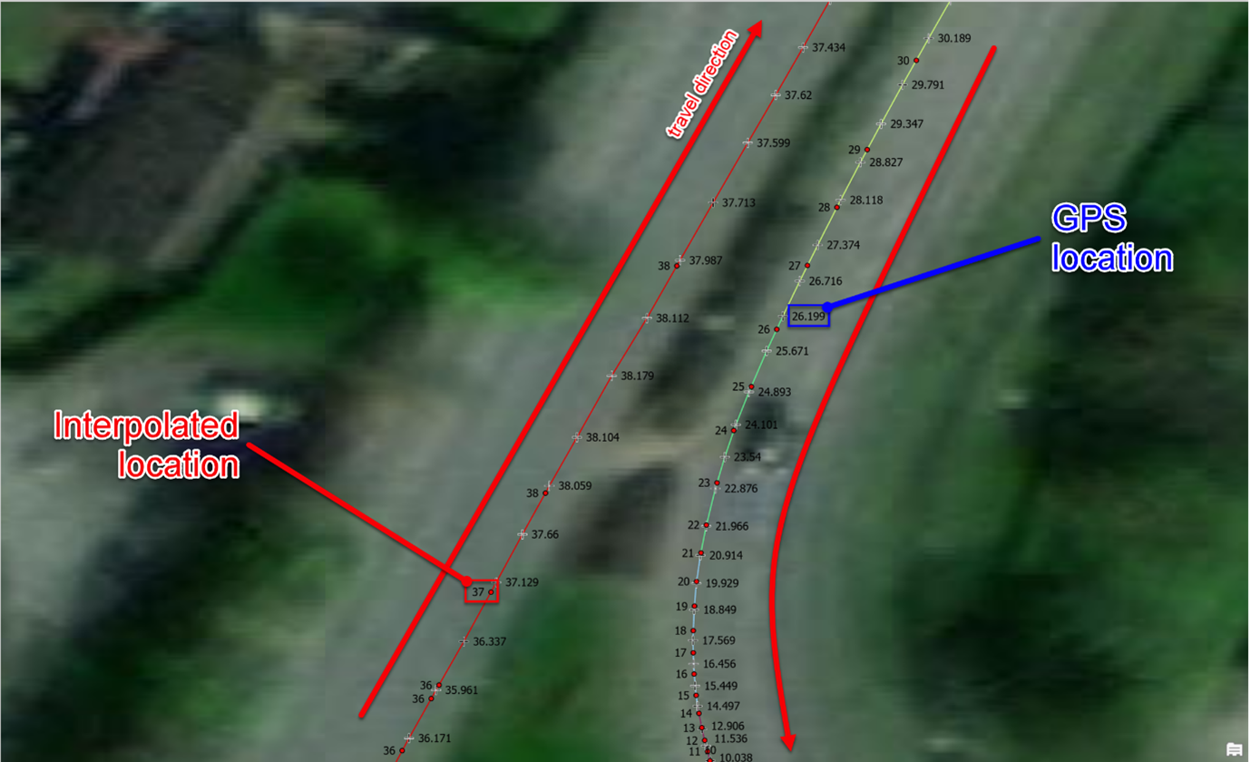
Having split out the separate journeys, we developed a tool to generate regularized speed boundaries from which acceleration windows could be extracted. The screenshot below illustrates what the tool does – it works out where the miles-per-hour boundaries are, given the GPS point speed measurements, interpolating the positions for the whole number boundaries, accounting for the acceleration/deceleration being experienced.
Acceleration windows
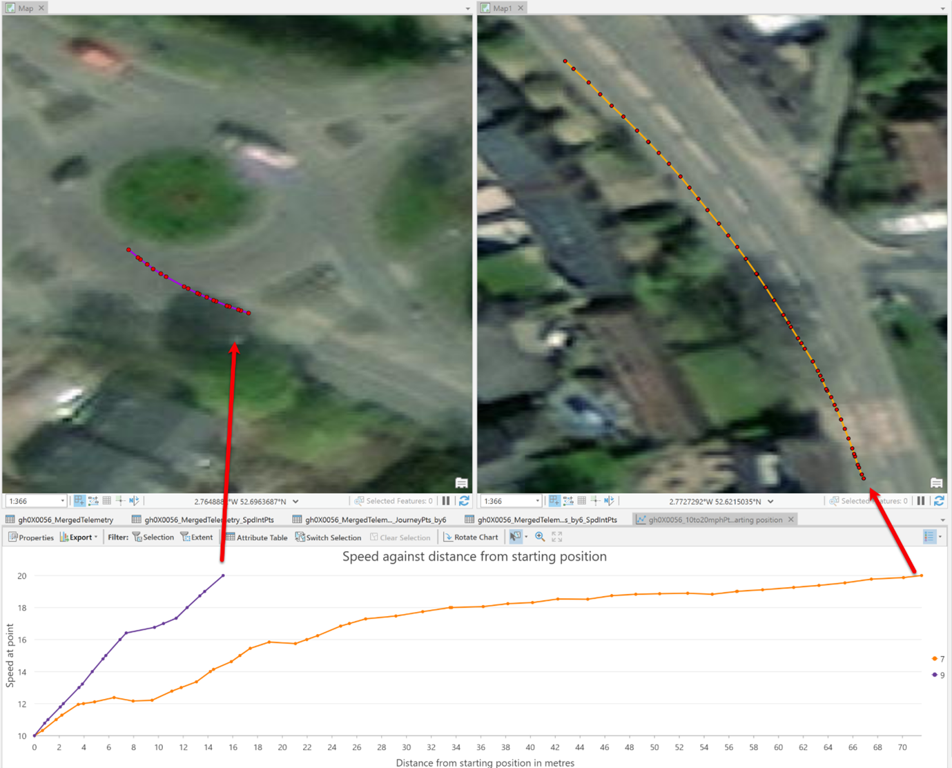
Having calculated the speed boundary points and integrated those with the source points, we created another tool that extracts specific acceleration or deceleration windows from the data. The screenshot below shows two example 10 to 20 mph acceleration windows:
- the left-hand map showing the shorter, faster accelerating, window, accelerating into a roundabout.
- the right-hand map showing the longer, slower accelerating, window, accelerating in a queue of traffic.
The screenshot illustrates some of the issues with extracting and then comparing acceleration windows – the most obvious being the fact that the acceleration isn’t constant for either of the example windows shown, owing to various factors, such as what other road users were doing, the performance of the car, the topography, etc.
These factors also limit the width of the acceleration windows that can be extracted – e.g., you don’t get many 0 mph to 30 mph windows recorded, so you have to reduce the width, as shown below where we use 16 mph to 18 mph as our window. The eagle-eyed will also note that the lower line actually has dips in it, when the vehicle decelerates slightly – we found that, with the high frequency GPS data from a GoPro (18 readings per second), it was necessary to apply a tolerance in order to be able to extract any continuous acceleration windows.
As part of our video change detection research, we’d captured video for the same route on multiple dates. This data allowed us to attempt to remove one of the variables – the physical properties of the road – i.e., its topography and morphology.
The screenshots below illustrate how, with increasing volumes of data for the same vehicle and route, you can start to understand how other parameters of interest – e.g., how big a load you are carrying – are affecting acceleration. Obviously, if that’s what you’re really interested in, conducting a targeted controlled experiment on a closed circuit is probably a more efficient way of getting better results.
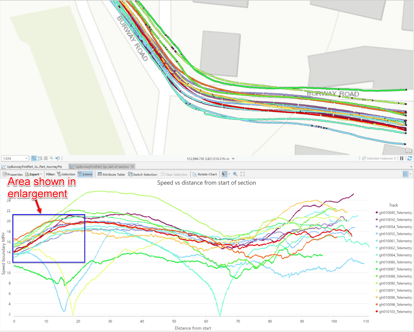
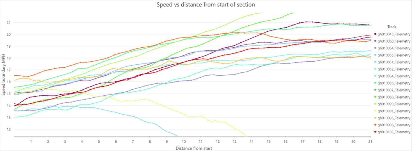
The pair of screenshots above show the speed profiles for multiple journeys along the same road in the same direction (from right to left in the map).
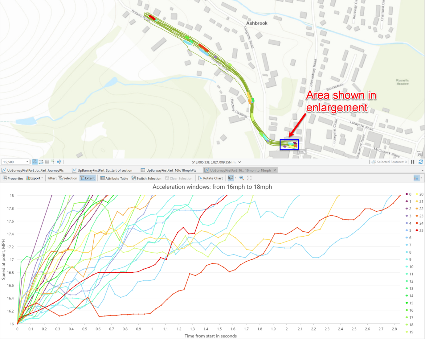
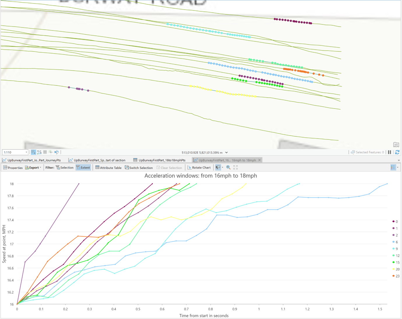
The lower screenshot illustrates how many, but not all, of the profiles vary in a similar pattern, but obviously there were journeys in which external factors – e.g., other road users – (probably) had an effect, as shown by the profiles that slow and drop off the bottom of the chart. It also illustrates how the start speed for the section varies, making detailed comparison of the profiles difficult. Extracting acceleration windows, as shown in the screenshots below showing extracted acceleration windows, enables that more detailed comparison to be made.
The upper screenshot in the pair above illustrates the great variability in acceleration over a small window – from 16 to 18 mph, over a section of road. The lower screenshot shows how even focussing on a small section does not bring much clarity. So, something of a waste of time, arguably.
Emissions
In 2009 the UK Government published its Road Vehicle Emission Factors report. Part of this report is a set of polynomial equations allowing the calculation of emissions for various pollutants for different vehicle classes at different (average) speeds. As described in the report, there are a multitude of factors affecting the emissions associated with any part of any journey, and hence the values calculated using the equations should be viewed as indicative only.
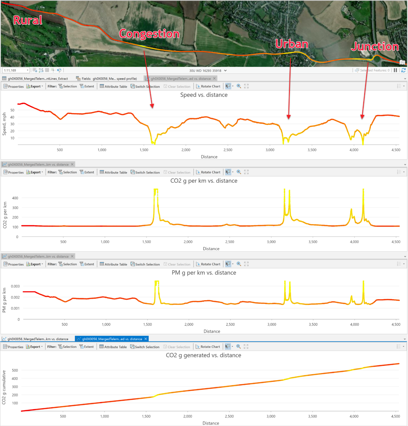
As we’d developed a toolset to generate speed segments, we could easily use the polynomials to calculate emissions for each speed segment and then sum these to get the total emissions for a particular journey. This gives an approximate way to determine which of multiple journeys has the worst emissions, as well as seeing where, and when, those emissions are being generated.
The values calculated using the polynomials are based on average journey speeds, so the ‘fine detail’ on the charts below should be ignored, but they do illustrate the general point made in the introduction that urban journeys, or those involving lots of starts and stops, will generate higher total levels of emissions than rural or motorway journeys involving steady (moderate) speeds, as journeys at low average speeds generate higher total emissions per km than those at moderate average speeds. The final chart shows the calculated cumulative CO2 emissions for the journey shown, and it’s worth noting that the spikes shown in the per km emission charts only result in modest bumps to the cumulative emissions – as the vehicle, on this segment of the journey, was only travelling at low speeds for a short period of time.
Other visualizations supported include the segmentation of the journey line into equal distance intervals which can then be symbolized by the emissions generated in each segment, or segmentation into acceleration, deceleration and steady speed segments. These derived data support the creation of statistics allowing the journeys to be characterized and classified in ways allowing the most and least efficient ICE journeys to be identified, supporting mixed fleet operators in reducing their overall emissions.
Accepting the issues with the data, but ignoring our statement about fine detail, our last map, shown below, illustrates some custom visualization functionality we’ve worked up to allow the variation in multiple parameters along a route to be visualised on a map –it is an interesting way of looking at the data, and one that can be extended to viewing in 3D, and possibly 4D. Obviously any visualization is only as good as the data you’re using, though…
Conclusion
In this blog post we’ve shown that you can process GPS data to support the analysis of vehicle motion, but that if you’re looking for defensible results, you probably would be better off running the data collection exercise as a controlled experiment, rather than relying on the real world to provide you with appropriate examples.
We have also demonstrated that approximations of emissions can be calculated on a per journey basis, and how these support the observation that a fleet operator with a limited number of zero emission vehicles wishing to maximize their decarbonization should switch out ICE vehicles for EVs for journeys through urban areas.
It is also worth noting that the emissions values calculated, if validated, could also be used to retrospectively calculate a fleet’s total emissions, if every journey were tracked. This information could be used in a variety of positive ways, to ensure compliance with climate change targets.
We created this movie using ArcGIS Pro to illustrate both this work and the work described in our blog on using GoPro video data in ArcGIS, please take a look!
If you’d like to find out more about this work, please feel free to contact us.
Posted by Ross Smail, Head of Innovation.
Data sources and Links
- The DSM used for the fly-through video is from Defra
- All other data is either copyright Esri and partners, and available through ArcGIS Pro, or copyright Exprodat.


