Last year we published a series of blogs reporting on some of the work we’d done processing and visualizing point cloud data within ArcGIS Pro to create Digital Twins . One of the reasons for creating these Digital Twins was to provide a base for displaying sensor data – e.g. visualizing temperature levels within different zones.
In this blog we look at how, using relatively cheap consumer electronics, some Python scripts and ArcGIS Online, we created a real-time display of activity in our London office. With many office closed for the global pandemic our timing wasn’t the greatest – there’s not been a great deal of activity in offices recently – but fortunately the sensors we used also record temperature and light levels, so we did get some data points to look at!
Sensors
The sensors we used for this project are part of the Philips Hue lighting range. We purchased a Hue Bridge and 5 Indoor sensors – total cost c. £200. The sensors report presence, temperature and light level via Wi-Fi to the Hue Bridge, which you connect to your network – an API is provided that allows the Hue Bridge to be queried to retrieve the values reported from the various sensors.
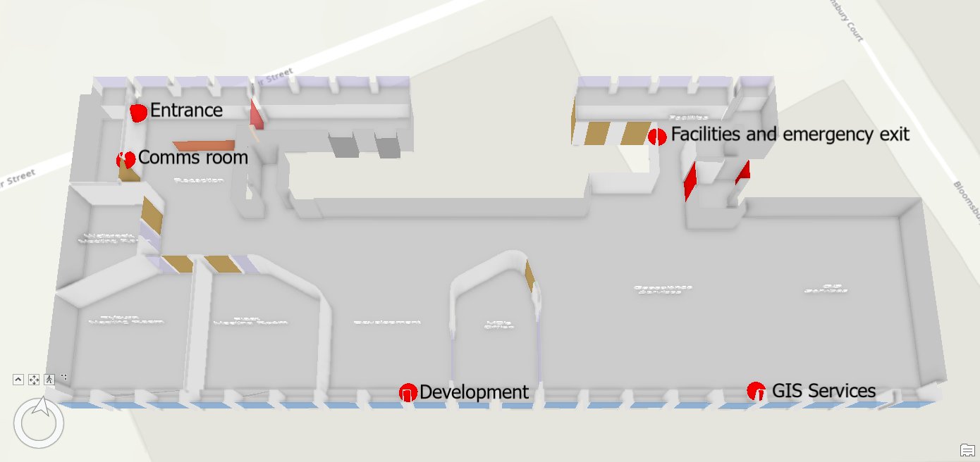
The sensors are very easy to install and to connect to the Hue Bridge. As we weren’t interested in using them to control our lighting, we placed them where they could observe movement: into the office, between the main office areas and into the comms room.
Spatializing
We created a set of feature classes to store the data we wanted to show on our map. We wanted to be able to display the current readings for each sensor and be able to display them over time. We also wanted to be able to display the presence readings as polygons representing the zones that the sensors were covering. We therefore created these 7 feature classes in 3 different File Geodatabases (we had no particular reason for splitting them out, here’s a zip), published these to ArcGIS Online and made them editable:
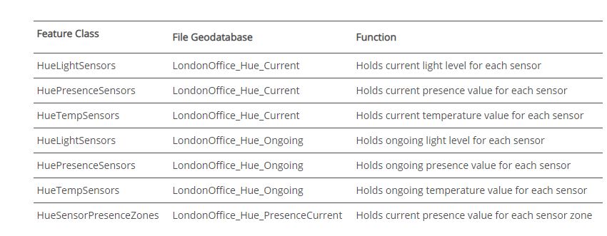
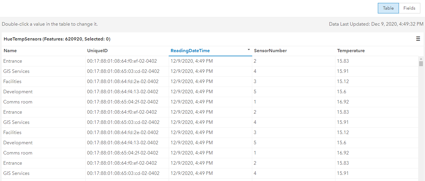
The screenshot below shows the data collated in the Ongoing HueTempSensors layer – as you can see, ArcGIS Online does support pretty large datasets. It is also worth noting that despite the display only showing the nearest minute for the date time value, the underlying value does contain seconds/milliseconds.
Scripting
Having published the ArcGIS Online data layers that were to hold the data, the next step was to write a routine to retrieve and upload the sensor data.
The Hue API is well documented and there are enthusiasts out there who blog about their use of it – all of which helped us to create this Python script that runs on a infinite loop, kicked off as a scheduled task at start-up on a virtual machine hosted in our office. The script also uses the ArcGIS API for Python, to handle the update of the ArcGIS Online feature layers.
The script executes the following workflow:
- Queries the Hue Bridge to retrieve a list of the connected sensors.
- Connects to ArcGIS Online and identifies the target feature layers.
- Loops through the sensors, retrieving their current values, and updating these to ArcGIS Online.
- Sleeps for 3 seconds and then repeats.
- Periodically, it deletes the rows that are more than 30 days old.
Performance
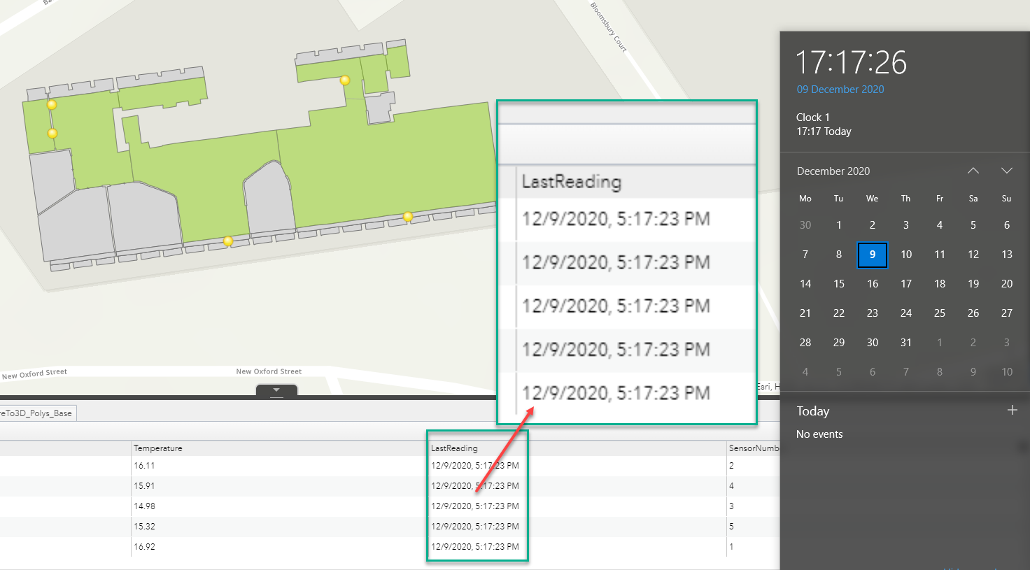
When we started, we didn’t really know if the set-up was going to work – if it took 5 minutes to retrieve and upload the information to ArcGIS Online, it wouldn’t really be real–time, would it? Obviously, the Hue sensors are developed to switch lights on with little more than a fraction of a second delay, so that side was unlikely to cause an issue – processing the data and uploading it to ArcGIS Online might cause a delay, though. As it turned out, that part doesn’t add much time – we only have an update lag of a few seconds – i.e. the sensor values are on the ArcGIS Online map within a few seconds of being sensed. That’s pretty impressive!
As the screenshot below shows, there’s a three second difference between the values in the map and the clock on my machine (I did check that the source machine and my machine have synchronized clocks). So, that’s 3 seconds for a journey from:
Sensor (in the London office)
to: Hue Bridge (London office)
to: Processing computer (London office)
to: ArcGIS Online (Esri cloud)
to: Client computer (my house – Shropshire)
Results – real–time monitoring
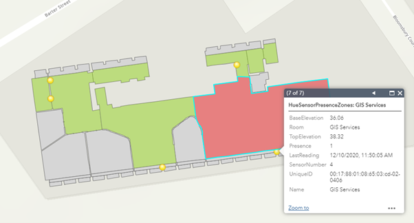
We created an ArcGIS Online Web Application Builder app to consume the current data. With these apps you can set the refresh time to be a few seconds, thereby matching the update frequency of the sensor data. The green zone polygons in the app turn red when presence is detected:
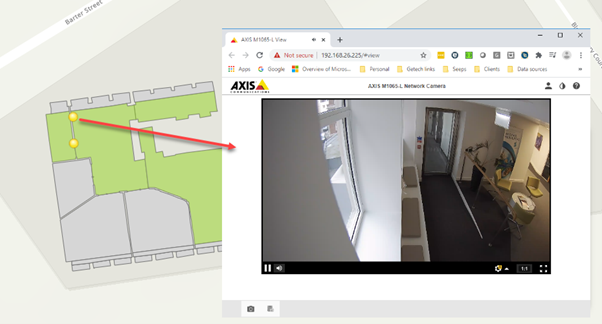
When combined with some video cameras, you can have the Big Brother system you’ve always dreamt of:
Results – ongoing monitoring
The ongoing datasets build up very quickly when you’re capturing 1 reading every 3 seconds, so capturing the different parameters at lower frequencies would probably be a sensible amendment to the script. ArcGIS Online copes pretty well with big point datasets, but I would say that configuring (and using) out-of-the-box ArcGIS Online web-based apps consuming the data requires some patience.
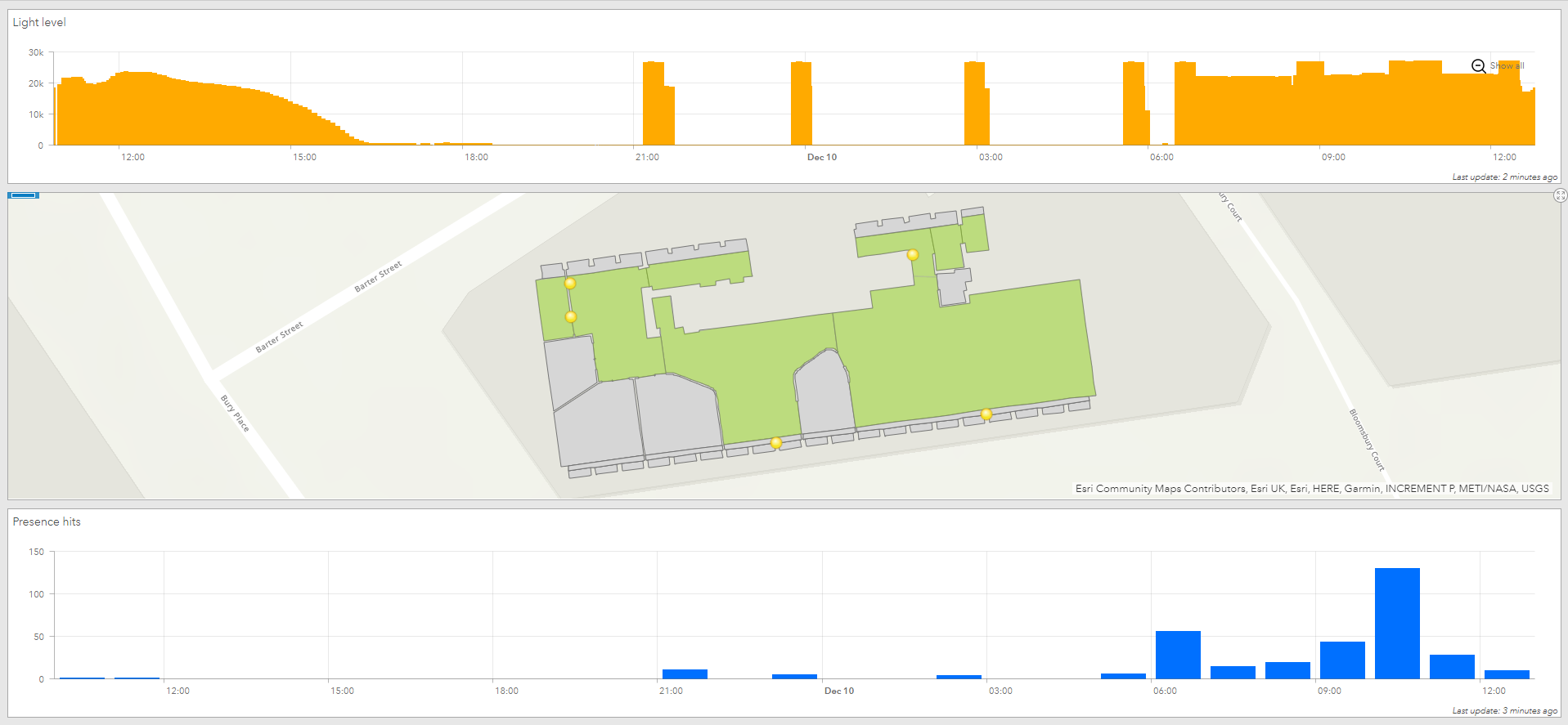
However, a simple dashboard showing the light levels (orange) and presence hits (blue) for the office does provide interesting and potentially useful insights into activity in the office – the light level spikes during the night are when the security guard was visiting the office as part of his patrol. Note that the “presence” detector actually senses motion, so if you stay reasonably still it doesn’t register a hit.
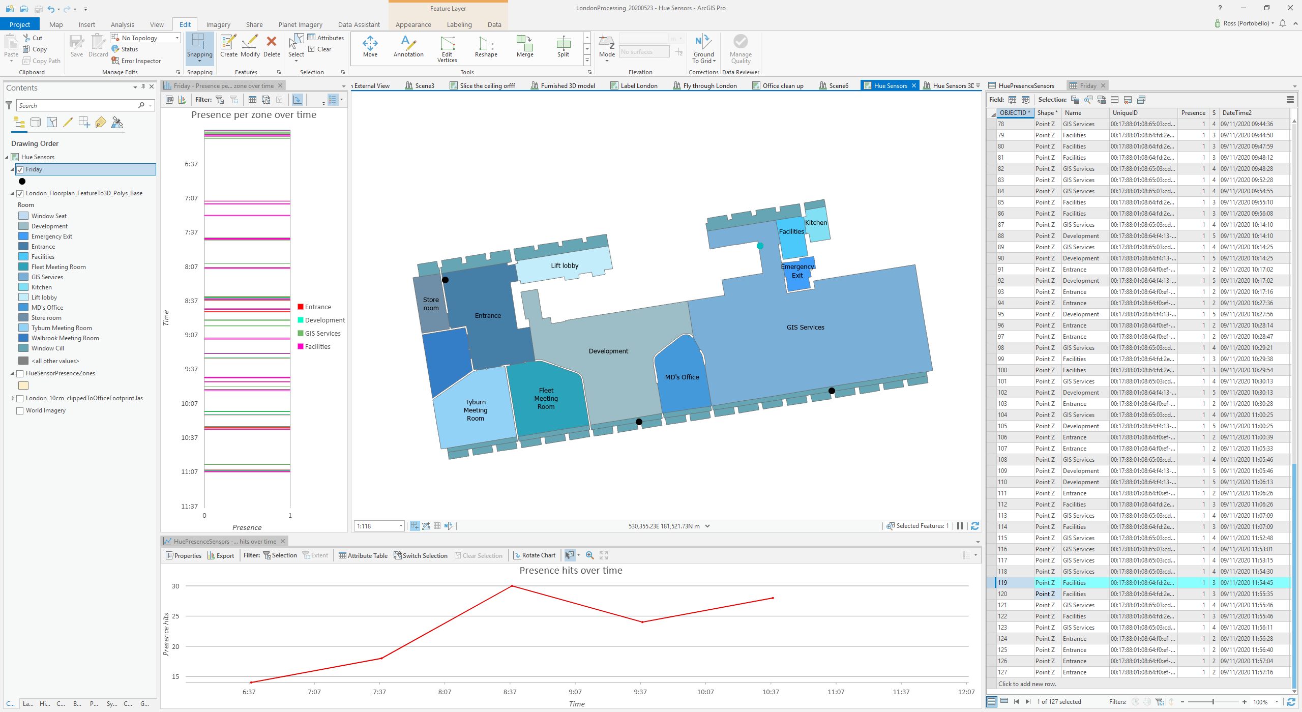
If you take the data out of ArcGIS Online and look at it using ArcGIS Pro, which handles big datasets with ease, you can look at identifying patterns of behaviour, and determine things like which meeting rooms are being used most frequently, and for how much of each day.
Clearly there is some scope for invading people’s privacy, even though the sensor data is anonymous – integrating it with other information (like the video data, obviously) or behavioural knowledge (when someone comes into the office) could allow you to gain insights that perhaps you ought not be able to. However, there may be times when this is actually useful – the screenshot below illustrates how, when you know there’s only one person in the office, you can effectively track their day – when they arrive and leave, when they use certain facilities, etc.
Conclusions
So, using ArcGIS Online, with a small investment in sensors and some scripting, we have created a real-time remote monitoring system for our office, allowing us to gain some insight into how it’s being used – or not being used, as is the case during the current pandemic.
It’s easy to see how having a live map showing this data to hand could assist in security and emergency situations, where you need to identify where people are, and also where they have been and so might be. There’s also the potential (with further work and data) to use pattern recognition to spot when unusual activity is happening without having to explicitly code rules – so, for example, if the security guard doesn’t turn up at the right interval, you could get an alert.
Integrating other sensor types such as smoke alarms would obviously increase the usefulness of the live map – perhaps in the future every facility, office and even home will have its own digital twin, dripping with live sensor data feeds and – who knows! – accessible to third parties such as family members or emergency services.
We hope you found this interesting – if you try out the scripts and have issues, please drop us a line.
Posted by Ross Smail, Head of Innovation.

