 In the last eight years, Esri users around the world have created nearly one million Story Maps to share their work and ideas.
Telling stories has always been an effective way of keeping an audience interested and by creating the Story Maps technology, Esri has made it easier for everyone to take advantage of this presentation style.
In the summer of 2019, Allen Carroll who is Program Manager for Story Telling at Esri, announced that after a year’s development, his company was ready to release the latest version of this popular technology.
We used this new version to create a Getech’s Story Map called “The Pelican Energy Transition”, which tells the story of Denmark’s move away from fossil fuels to renewable sources of energy.
The information for our Story Map came from the comprehensive and detailed report A Snapshot of the Danish Energy Transition by the German think-tank and policy institute Agora Energiewende.
In this paper Dr. Stephanie Ropenus and Prof. Henrik Klinge Jacobsen explore how a country can, with the right incentives and a cohesive approach, tackle the complex issue of the Energy Transition.
 To start creating a Story Map, simply visit https://storymaps.arcgis.com/ and log-in to access ‘My Stories’.
Clicking the ‘Create new story’ button will launch a blank template consisting of a header title bar and the start of the rest of the story.
For our Story Map, we used the Mesa theme which can be accessed by selecting the Design menu option.
Alongside ‘Design’ is a critical button – ‘Publish’ – which saves the changes to your Story Map, checks for any errors and creates the public-facing application.
Adding components to a Story Map is very simple.
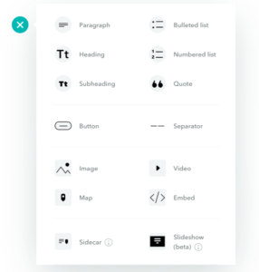 Clicking on the green ‘plus’ button, brings up a menu of options. Select which one you want in the page and the software does the rest.
The only option that may need some further explanation is the ‘Sidecar’ option. This allows the reader to scroll through a collection of images, maps or videos while scrolling text complements the media presented.
We used this to present the charts form the report and also to add an interactive ‘swipe’ map (also a Story Map) that shows the differences in energy plant locations between 1980 and 2017.
We hope you find our Story Map a fun and informative read and please get in touch if you would like more information about the Energy Transition or creating Esri Story Maps of your own.
Read The Pelican Energy Transition.
Posted by Alistair Maclenan, Marketing Consultant, Getech.

